In previous articles we have discussed semiotics as a powerful tool for product innovation and analyzing advertising. Using semiotics, brands can take advantage of codes to help them succeed in the marketplace. However, there is a difference between the cultural meaning of a code and that code in relation to a specific category. For example, in Western culture black is generally associated with death, but in a specific product category such as whiskey it can mean the brand is premium, as in “black label”.
Semiological meanings are long lasting and evolve slowly, whereas semiotic meanings are more dynamic. Using semiotics, brands can play with codes to create trends within product categories. There is also an interplay between the semiotic and semiological level; codes used in categories can gradually act on and change codes in the broader cultural context.
Interestingly, both cultural and categorical meanings behind codes are different in China. If a company develops a product without being aware the colors used in its brand identity or packaging design are semiologically loaded, they will raise expectations about that product that they will have to deliver. A beverage with a green leaf on the label creates the expectation of green tea; Chinese consumers may be surprised if it turns out to be peppermint.
Let’s examine the difference between semiotics and semiology by looking more closely at culturally significant colour in China- the colour red.
RED AND CHINA
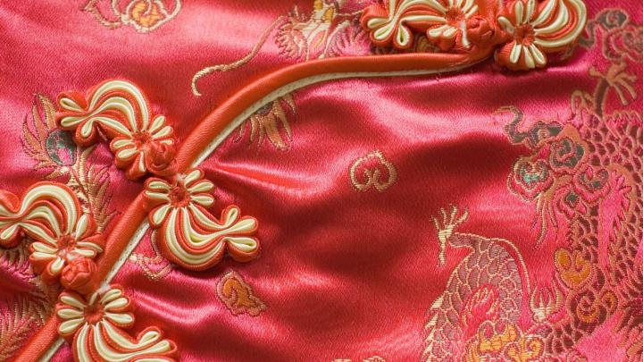
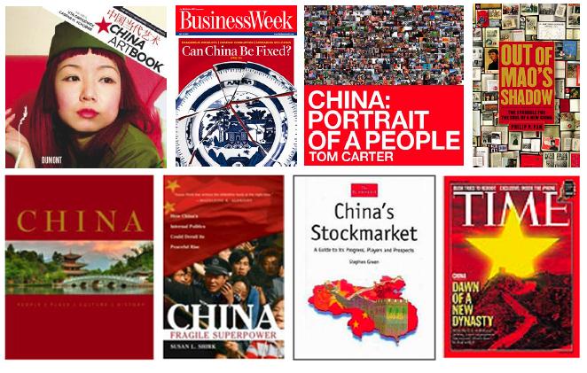
No other country has a well-known national colour like China with its red. If you look at a book or a magazine issue related to China, the cover is likely to be red.
Throughout the country you can find the color red: on the national flag, on the walls of the Forbidden City, and during the Chinese new year festival. Red is also the color of the Chinese National Pavilion of the 2010 Shanghai World Expo.

SEMIOLOGIC MEANINGS
The discussion above illustrates that the color red can convey many different meanings . Some are related to everyday life while others have special connotations linked to individuals, groups, the past and the present. The semiologic approach looks at how the various meanings behind the red color can be used to understand the Chinese culture and the meaning behind the codes. We can easily imagine that a brand with a very strong red identity like Coca-Cola needs to understand and decode this reality before entering the Chinese market.
RED DECODED
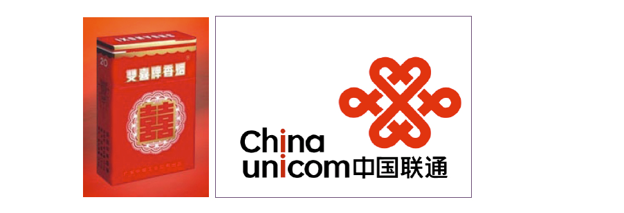
These meanings can help us decode some Chinese packaging designs, such as the cigarettes called “Double Happiness” that you can see at special events and weddings, which are consistent with the Chinese “lucky” meaning of red.
The brand “China Unicom” reinforces its Chinese identity and impacts its target audience through its black and red design. The logo is derived from the Chinese Buddhism graphic “Pan Zhang” or “Lucky Buddha Knot”. The red color therefore also brings luck and joy.
This decoding of meanings also allows us to better understand the successful cosmetics brand Yue Sai bought by L’Oreal in 2004. Launched by famous television personality Yue Sai Kan in 1992, the brand opened a new market by introducing the idea of make-up in China for Chinese women.
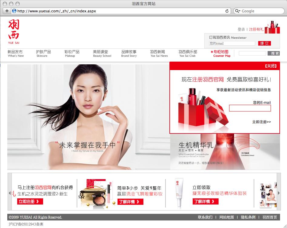
The red color here stands for Chinese, happiness, and luck, but also is also a symbol of femininity, fashion, and lifestyle, like red lipstick. It is based on codes from Chinese heritage but brings a new meaning at the same time.
This last example also reminds us that we have to be careful when decoding “red colors” that are not necessarily related to Chinese red traditional connotations. Red in China is not only “Chinese red”. It can be a code for a strawberry flavor, a metaphor for love, or used only for its visual impact.
CALLING ON SEMIOTICS
From these different examples, we can see that a “red” sign can possess many connotations. Red is widely used in China in brand identity and packaging design. But, when looking at a red sign, how can you know if it is communicating about revolution, luck, virtue, flavor, or something entirely different?
And that’s where semiotics enlightens. By defining a frame of reference and by systematically looking at differences and oppositions within a specific category, semiotics allows us to grasp the real meaning behind a given code. Let’s take the example of traffic lights. Whether you are in China or elsewhere in the world, red means “stop”, as opposed to orange and green, and has nothing to do with “luck” or “power”.
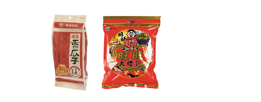
Semiotics can also be seen in relation to packaging design. For instance, within the framework of salted snacks packaging, red is combined with “open shapes” and opposed to “faded colors” and “closed shapes”. It symbolizes festive, lively, open, and spontaneity whereas “faded colors” and “closed shapes” refer to the past and tradition.
To conclude, we can say that semiology studies signs from a general point of view, through its different meanings, whereas semiotics, by defining a framework, analyzing the signs within this framework and through differentiation with other elements, allows us to make a selection and be more precise in the understanding of the meaning.
This differentiation between semiotics and semiology allows us to understand that it is very difficult to establish general rules about colors. The meaning of the colour red will depend upon context. This differentiation is crucial for brand identity and packaging design development as it is from considering these two levels that good creations will emerge.
Semiology allows us to understand codes in general. It is important to know them as a reference and as a source of inspiration. Semiotics allows us to analyze competitors’ identity and packaging design to understand the codes and the meanings behind the codes for our target market. By combining the two a brand can go beyond conventional meanings to create powerful concepts and unique identities.
Sources :
Chinese red, Yan Chunling, Foreign languages press
Chinese symbolism and art motifs, C.A.S Williams, tuttle edition
Etudes “semios” et enquêtes en enterprise, C Legris-Desportes, P Capron, P Couton-Wyporek, D Tsala Effa, les 2 encres
A Labbrand Group Company © 2005-2024 Labbrand All rights reserved
沪ICP备17001253号-3To improve your experience, we use cookies to provide social media features, offer you content that targets your particular interests, and analyse the performance of our advertising campaigns. By clicking on “Accept” you consent to all cookies. You also have the option to click “Reject” to limit the use of certain types of cookies. Please be aware that rejecting cookies may affect your website browsing experience and limit the use of some personalised features.