Navigating the dynamic landscape of China’s market, characterized by a rapidly evolving economy and the ascent of the middle class, poses a strategic challenge for global brands. The influx of global brands into China prompts a critical examination of existing brand platforms. The key question emerges: How can a global brand effectively build its identity in the diverse and ever-changing Chinese market? This dilemma underscores the balance between adhering to global standards and localizing strategies for maximum resonance. In this exploration of brand strategy, discover the nuanced approach required for successful brand identity building in China.
Today, many foreign brands opt for the latter. A journey to the supermarket reveals insights into cross-cultural branding and the varied approaches to communicating a brand signature. The discovery begins with a focused study on global brand marks in the market, from consumer-packaged goods to some of the most well-known names in technology, fashion, luxury, automobile and hospitality industries.
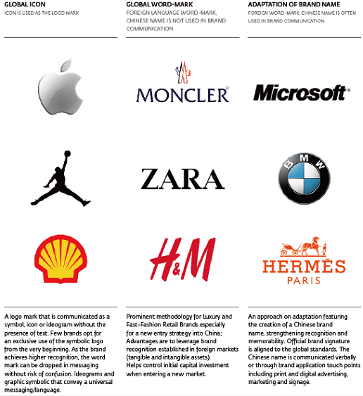
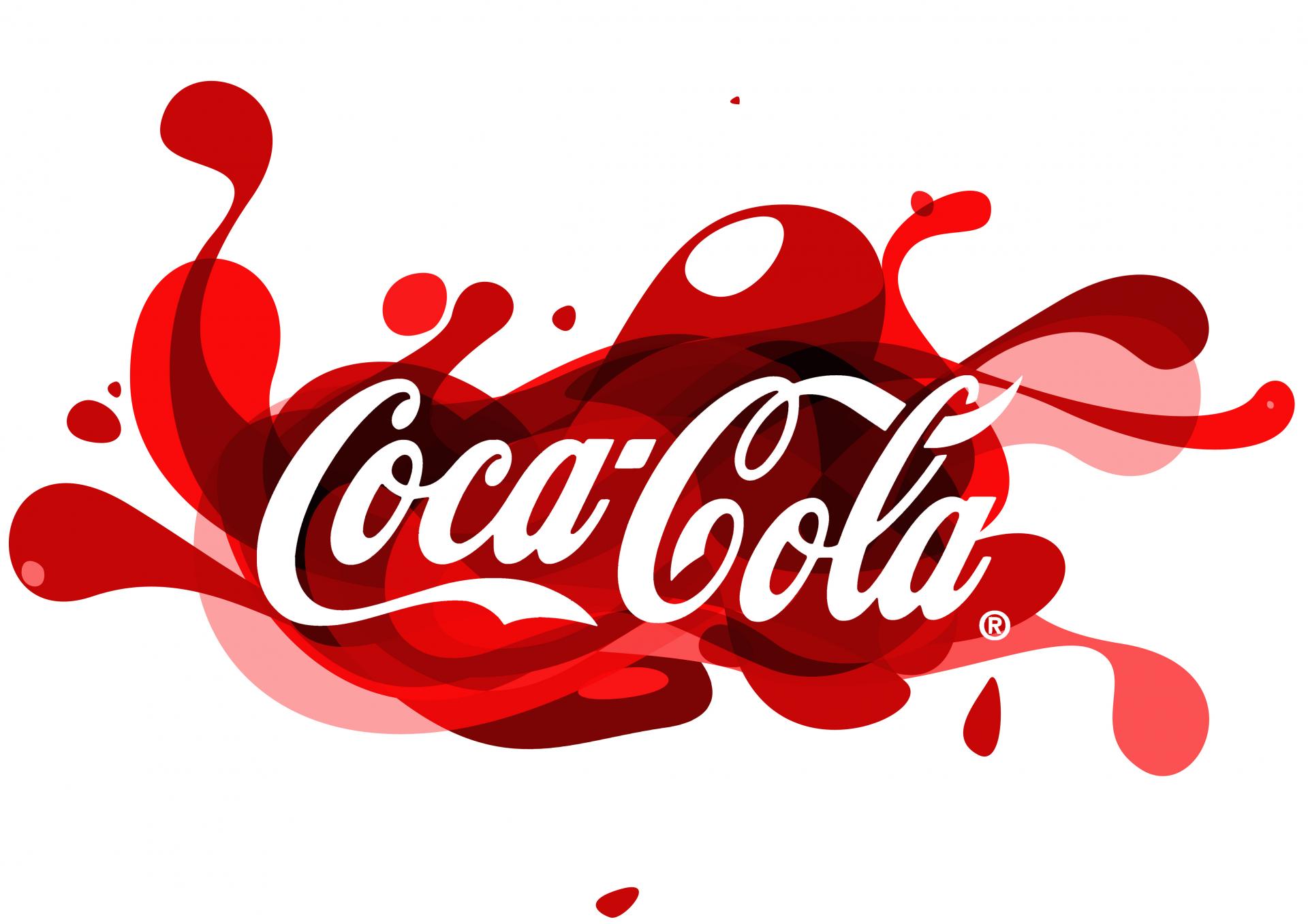
We recognize Coca-Cola by its expressive script signature, just as we know Apple by its synonymous visual iconography. The Coca-Cola logotype presents a classic word mark approach to the brand name. Its customized type-driven solution is adapted internationally into different languages and across diverse markets. Apple represents another categorization of brand marks known as the symbol or icon. The renowned mark features a universal icon—a modern hieroglyph or pictograph approach to communicating the brand name. The speculation on golden ratio symmetry may be a contributing factor to its highly recognizable identity and memorable form. However, true universal icons capable of transcending beyond linguistic barriers are extremely rare. Additional examples of symbolic iconic marks are Shell, Nike, Mickey Mouse, and World Wildlife Fund presented as a black and white panda illustration.
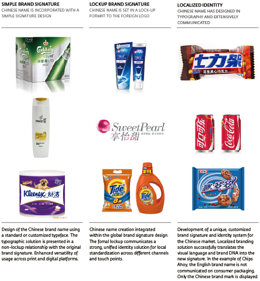
The Brand Identity Spectrum in China suggests a need for consistency across typographical pairings beyond the creation of a Chinese name.
What we often come across are Chinese brand name solutions materialized in a generic and undifferentiated Chinese typeface such as Hei typeface (Boldface) or Song typeface. However, entering a new market such as China is optimally served by creating an impactful first impression that accurately represent the brand experience – in another word, a more design-centric approach to the typography usage of the Chinese brand name.
TYPOGRAPHY IS NOT MERELY A “FONT”
Typography is more than simple “font” usage. It is the art, craft or process of composing type. Traditionally associated with the typesetting of print, the terminology has evolved to address a broader context involving design, or the selection and arrangement of letterforms within a space, to be printed or displayed electronically. Modern typography signifies a revolutionary change in design thinking — a reflection of contemporary views for simplicity and a universal method of communication.
Over the last three decades, advancements in digital font technology have significantly changed the typographic landscape. The progression from Postscript and TrueType (.ttf) fonts to the more current OpenType (.otf) format provides end users with immediate accessibility, robust glyph features, and multi-language support across Mac and Windows desktop operating systems. These revolutions are significant to the way we experience design and use type in our day-to-day communications.
Prior to development of web fonts, brand identity and web designers could only choose between a mixture of eight to ten core web-safe fonts—the eight to ten that are universally preinstalled on every Windows and Mac computer—ensuring the display of content across multiple browsers. Today, web fonts enrich our digital experience of brands. The wide range of available choices for typography offers seamless integration of brand identity standards between print and interactive channels.
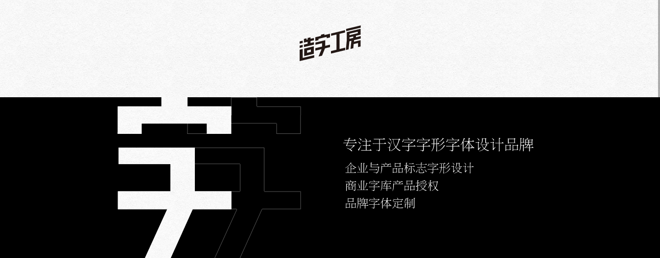
The modernization of Chinese typography follows a similar evolutionary path from traditional calligraphic script, to wood block printing, to digital type. The amount of characters in the language demands extensive time and dedication to build. Furthermore, web font technology around Chinese typography has yet to catch up. Institutional type foundries—such as Founder Type (方正字库), WenDing (文鼎字库), HanYi (汉仪字库) and HuaKang (华康字库)—and boutique foundries like Zao Zi Gong Fang (造字工坊)are dedicated to the forward momentum of bringing Chinese typography into the 21st century.
ROLE OF TYPOGRAPHY IN BRAND IDENTITY CREATION
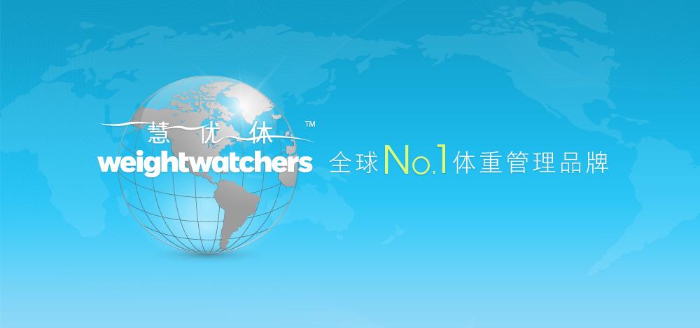
Weight Watchers is an interesting example of a brand identity adaptation for China. Founded in the 1960s, the U.S. based company has introduced its healthy weight control programs to around 30 countries by adapting a localization strategy and naming for international markets.
Weight Watchers’ brand recognition and identity in the U.S. is very strong. The brand signature features bold sans-serif letterforms that progressively gradients from black to a very light, weightless grey against a white background. For its brand adaptation into China, Weight Watchers’ has a strong Chinese brand name 慧优体 [huì yōu tǐ]. 慧 [huì] represents intelligence, a brand heritage of Weight Watchers. 优[yōu] means optimized and excellence while 体[tǐ] means body.
However, Weight Watchers has created what appears to be a separate identity locked up with a thinner typography for the new Chinese name, thicker original English typeface, plus a floating TM sign. Visualize a skinny lady with a light-colored scarf doing yoga; than see a bigger-framed woman who enjoys the sun and actively hits the gym 4-5 days a week for the power treadmill. The two typefaces seem to express polarizing personalities, sharing minimal commonalities except sans serif.
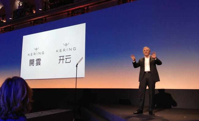
In March 2013, the luxury conglomerate PPR announced their name change to Kering. The significance of Chinese consumers for luxury products is reflected in Kering’s simultaneous announcement of their new Chinese name 开云 [kāi yún], in both simplified and traditional Chinese. According to Chief Executive Officer François-Henri Pinault, the Chinese name 开云 [kāi yún] means good luck because it sounds similar to another Chinese word 开运 [kāi yùn] or “opening of luck.” The openness and approachability of the sans-serif word Kering is reflected within the design language of the Chinese characters 开云. The same attention to detail and design standards to typography was applied for consistent messaging and resonance with the global brand.
Kering is a unique showcase of luxury conglomerate initiating a global rebranding. Unlike other fashion and luxury conglomerate who adopts a Global Standardization strategy in China, Kering is stepping into a more localized and integrated brand identity.
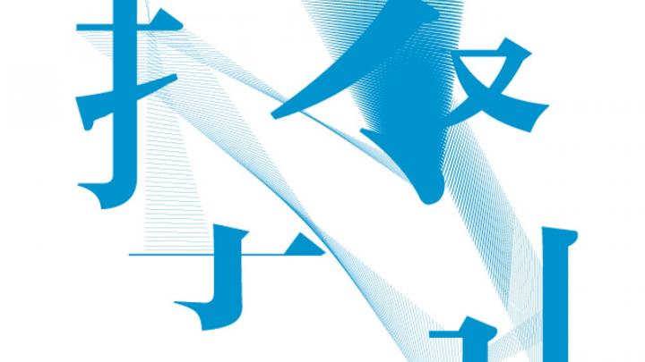
In the intricate landscape of China’s market, the art of building brand identity goes beyond mere nomenclature. A brand’s Chinese name possesses the enchantment to captivate attention and etch a lasting impression in the minds of consumers. Delving deeper, brands can unlock the full potential of their Chinese names by intricately crafting the typography of the characters. Every stroke and brushstroke becomes a canvas to convey a distinctive brand identity, seamlessly blending with the essence of the original signature. Explore the nuanced interplay of linguistic aesthetics and brand identity as we unravel the significance of building brand resonance through the artistry of Chinese characters.
A Labbrand Group Company © 2005-2024 Labbrand All rights reserved
沪ICP备17001253号-3To improve your experience, we use cookies to provide social media features, offer you content that targets your particular interests, and analyse the performance of our advertising campaigns. By clicking on “Accept” you consent to all cookies. You also have the option to click “Reject” to limit the use of certain types of cookies. Please be aware that rejecting cookies may affect your website browsing experience and limit the use of some personalised features.